about
about
research
research
development
development
visuals
visuals

onmotion fitness

OnMotion is an NYC-based fitness app designed for efficiency. It offers tailored workout recommendations and multi-layered search functionality, addressing the common problem of fitness apps being time-consuming to customize or requiring prior knowledge in sports.

my product focus

My focus at OnMotion was optimizing the complete service experience, understanding user motivations, analyzing competitor strategies, and identifying unique selling propositions. I designed over 50 interactive prototype screens in Figma and collaborated closely with developers to guide the backend construction of the application. Additionally, I was responsible for the marketing visuals and building their website.

user research

Having the initial foundations in beta and knowing more about our users, we began to look at solutions as a team. We held meetings and brainstormed in a shared board with the marketing and development teams. I worked on finding solutions through conversations with users and floated those ideas by people we’ve spoken to before. During these sessions, we collected and organized information by function for later evaluation. We developed several conceptual maps using tools such as the Six Thinking Hats and the Futures Workshop. Additionally, we used AI to generate a comparative version

eliminating redundancies

I organized functions based on importance to our users. I evaluated these ideas by relying on conversations and tests we've run previously, along with data from our earlier beta release. It was very important to me to take a critical look at OnMotion's functionality to eliminate redundancies and allow enough time to design and develop high-quality functions that would deliver desired results efficiently.

saturated market

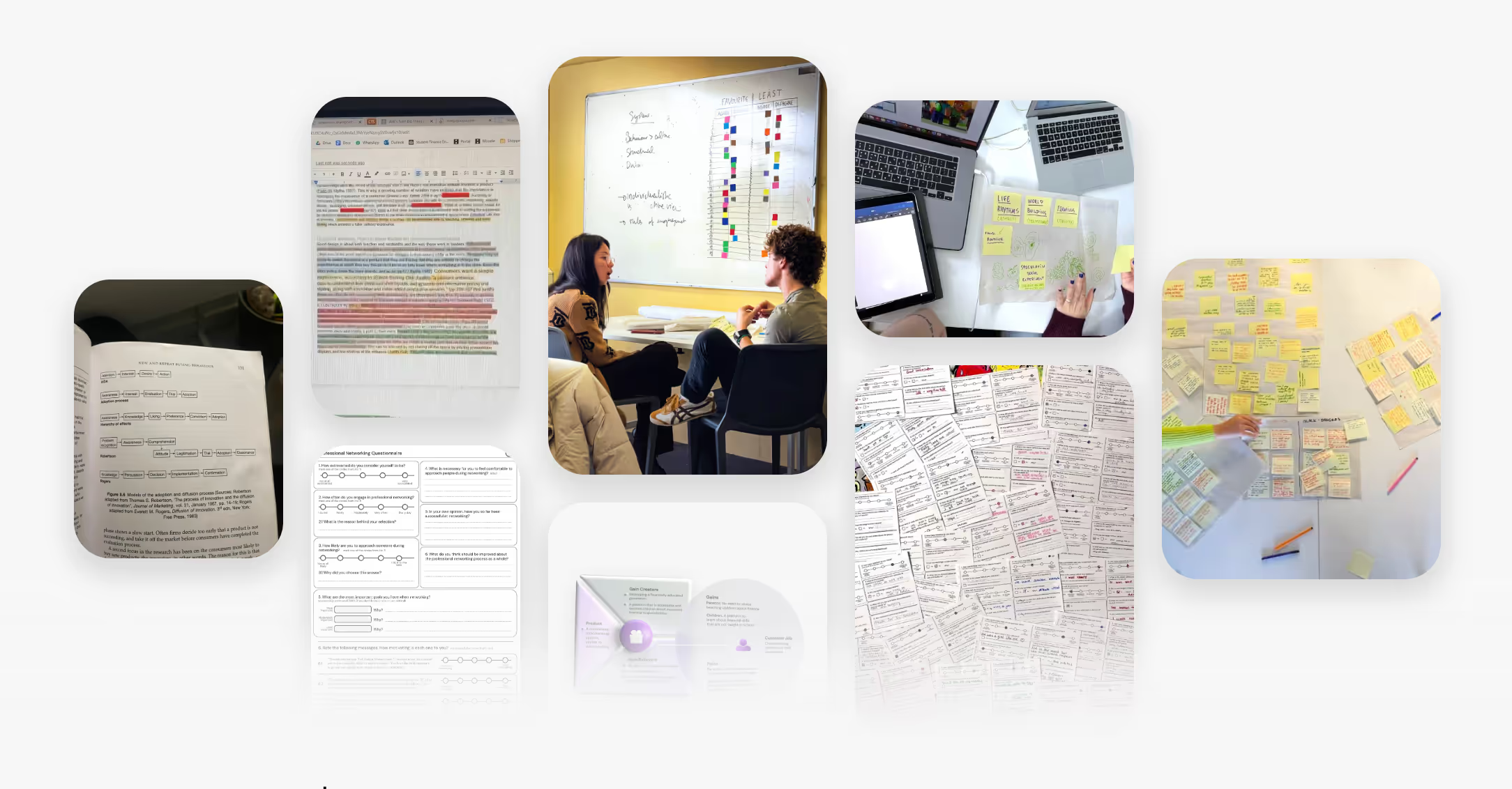
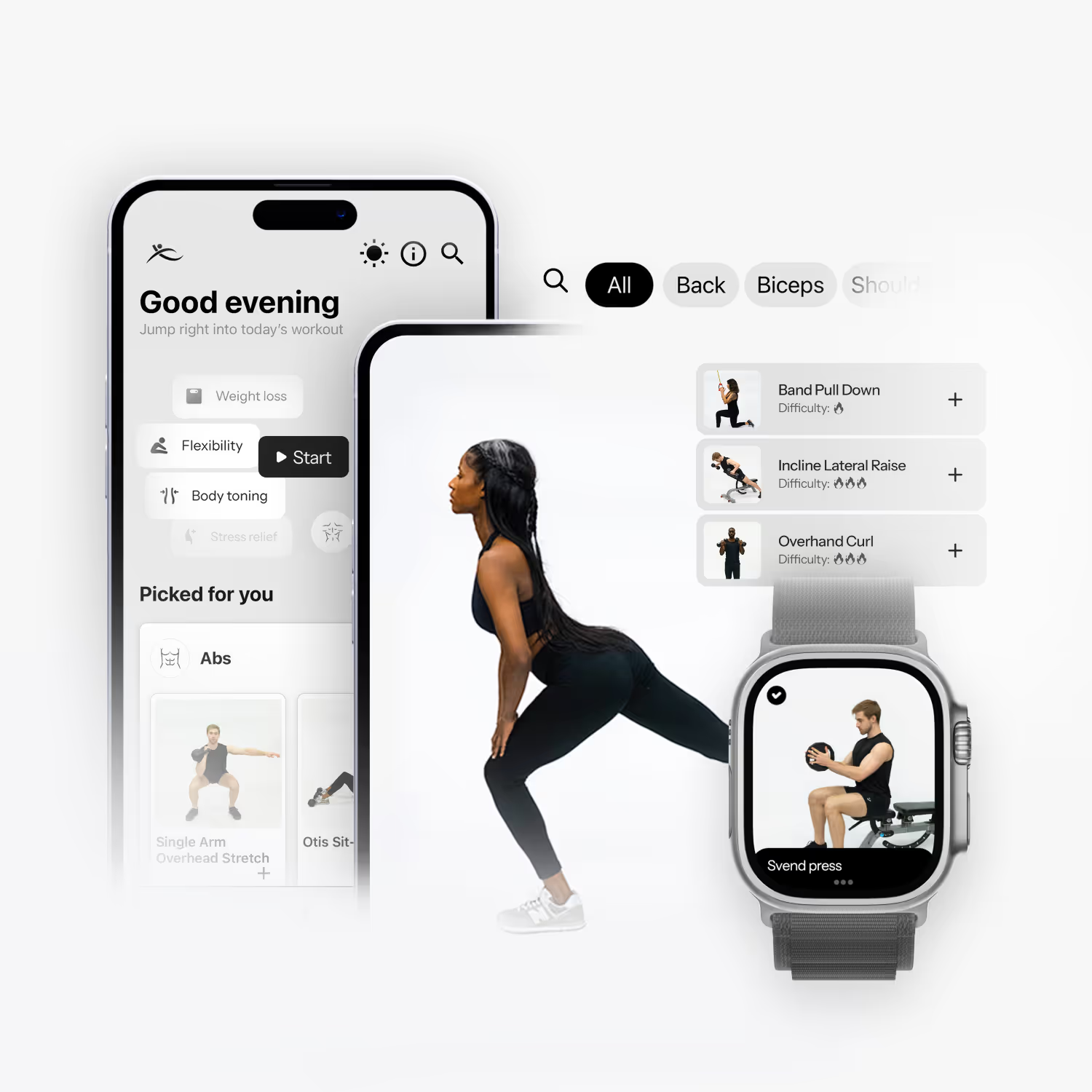
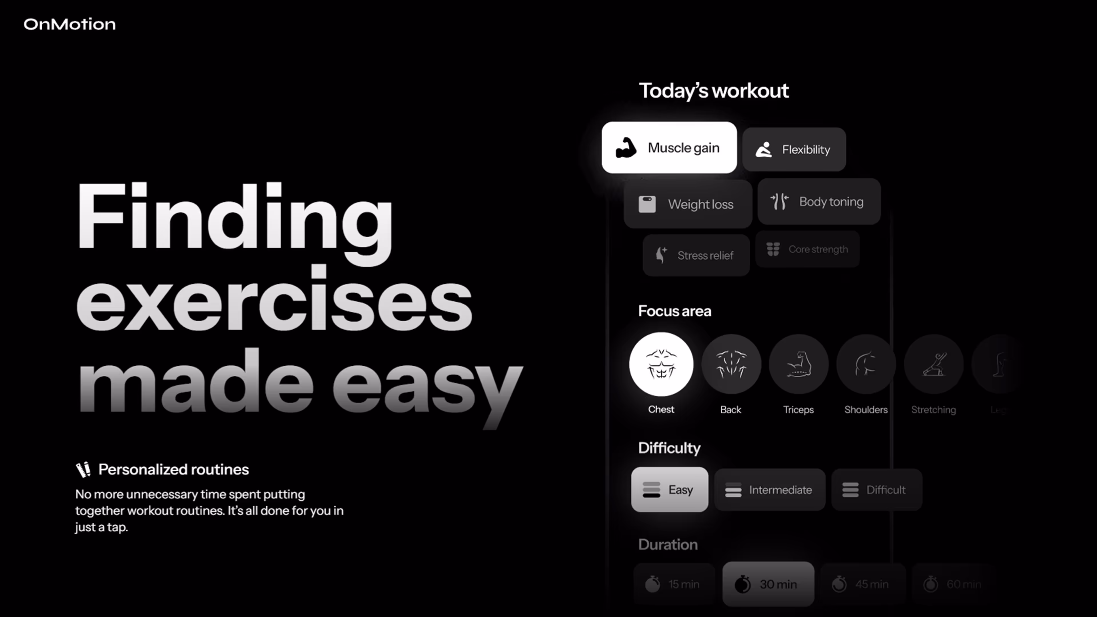
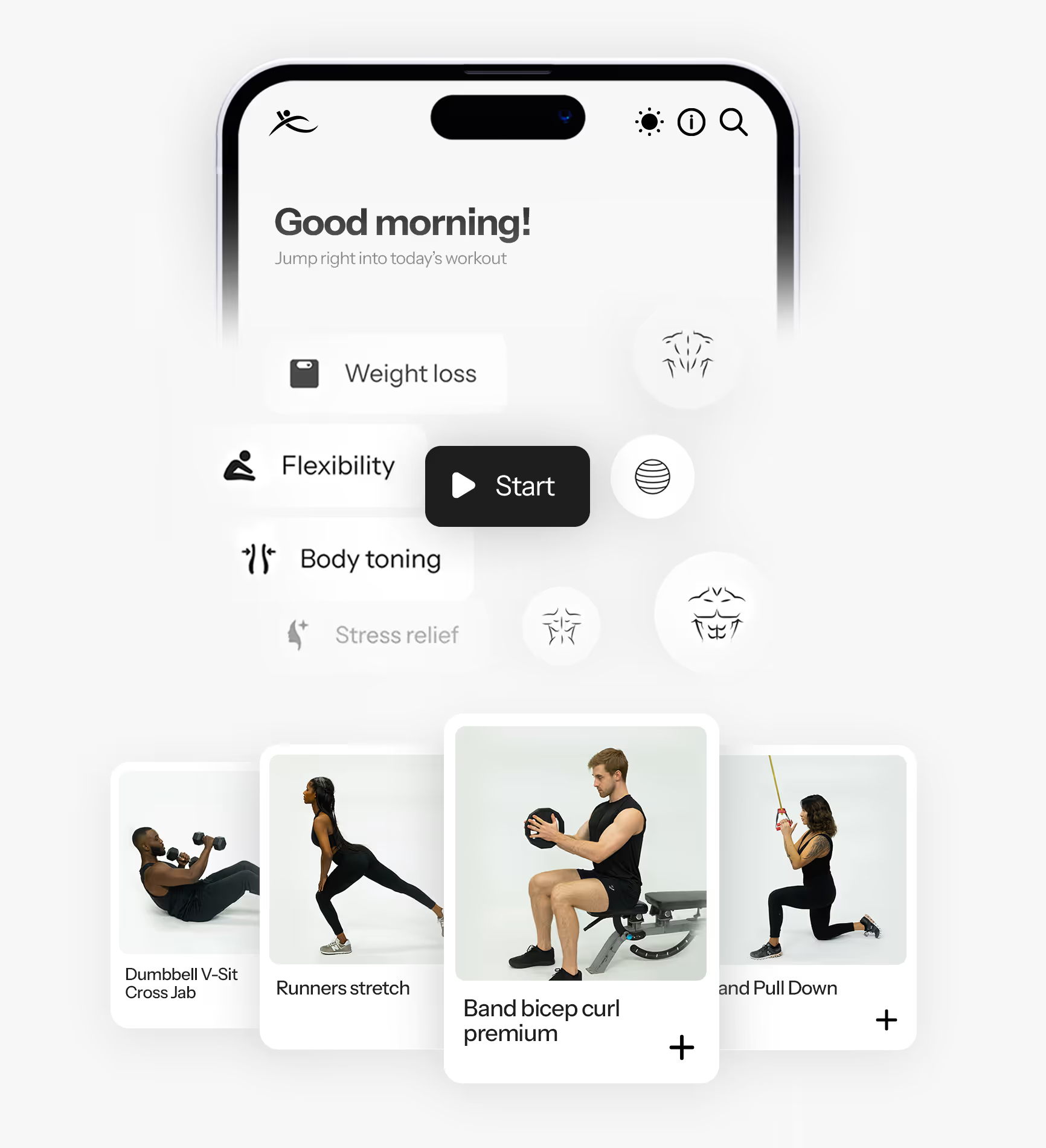
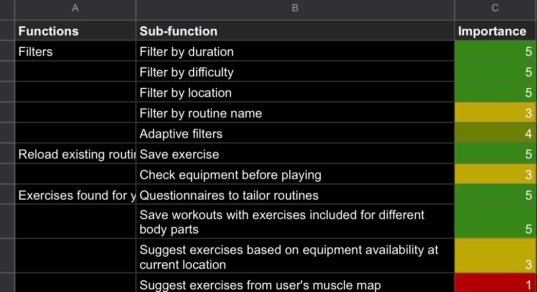
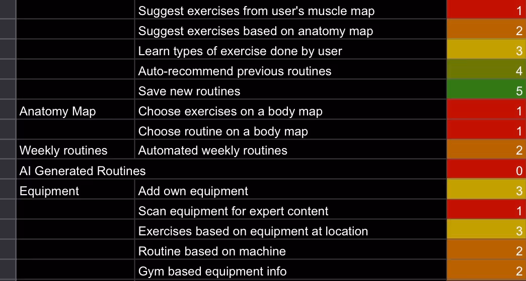
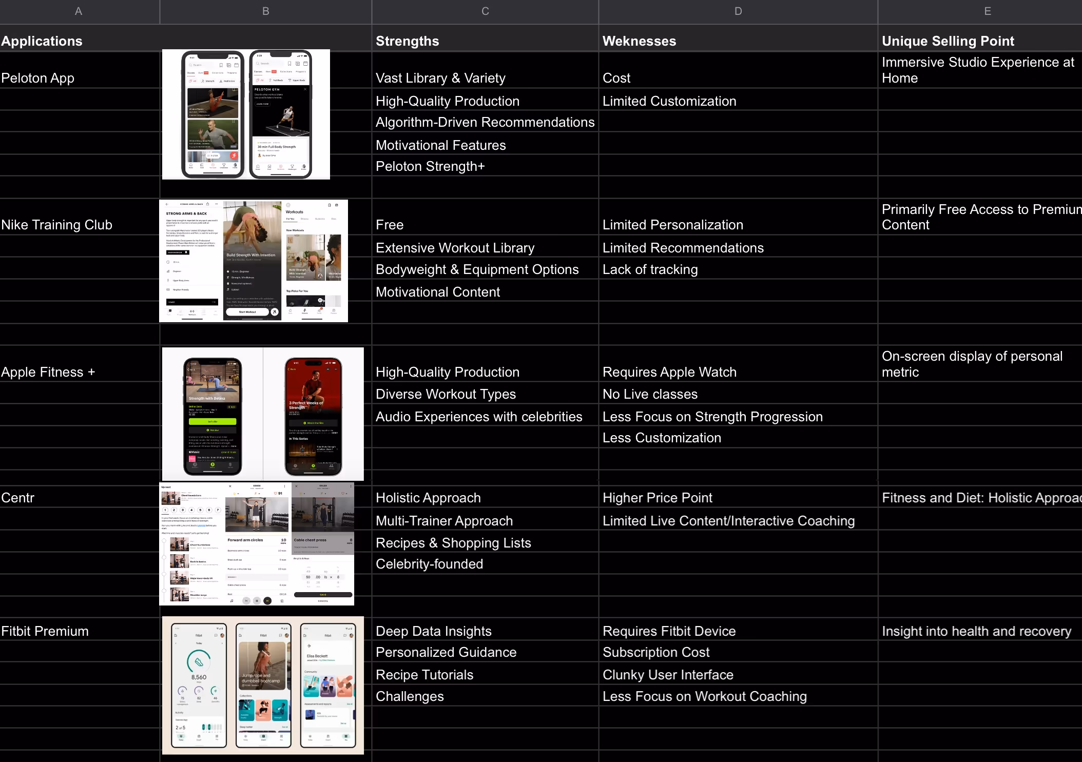
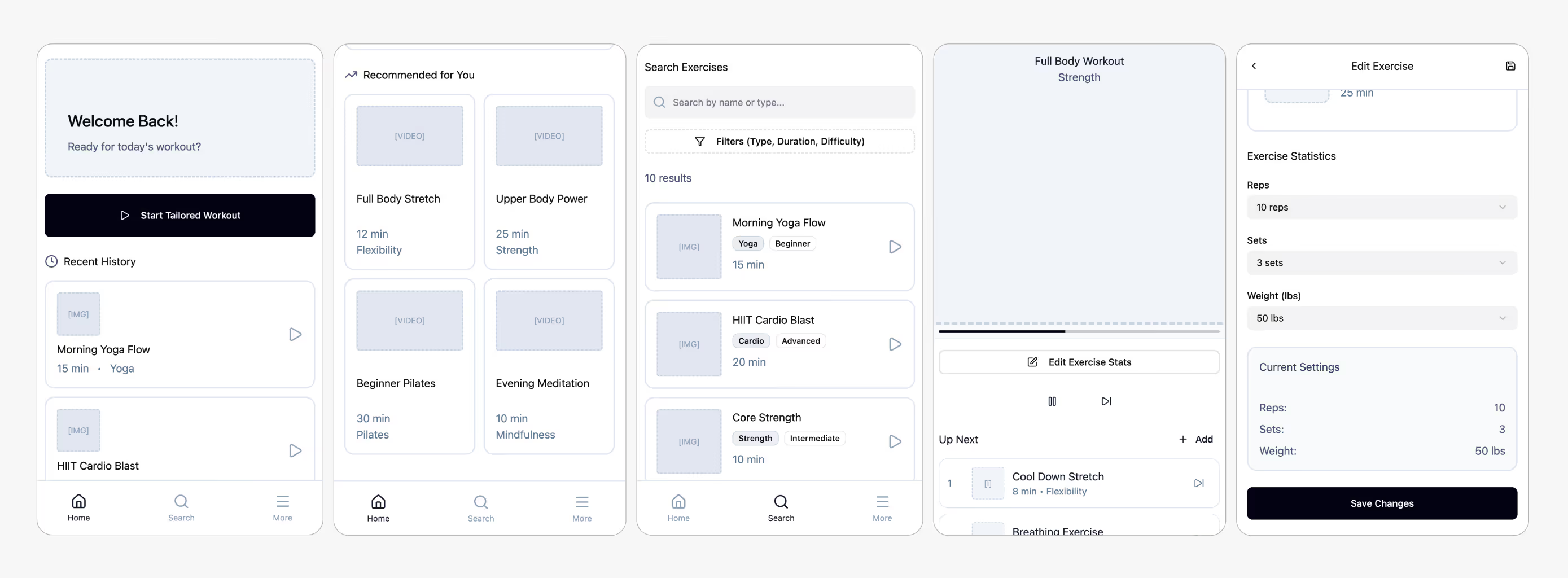
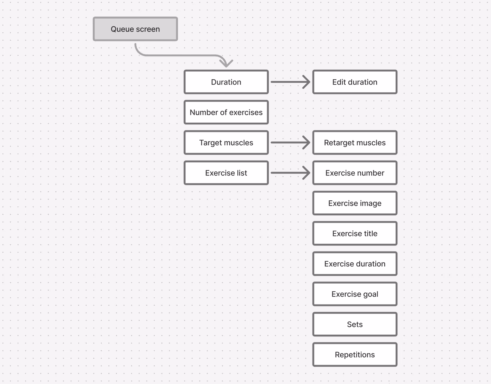
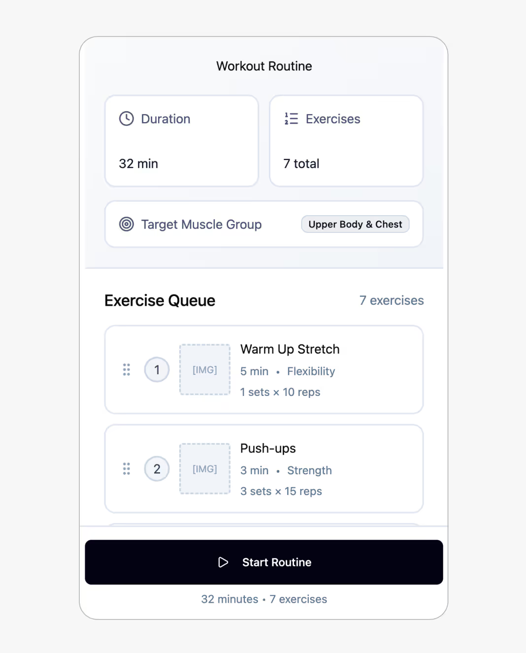
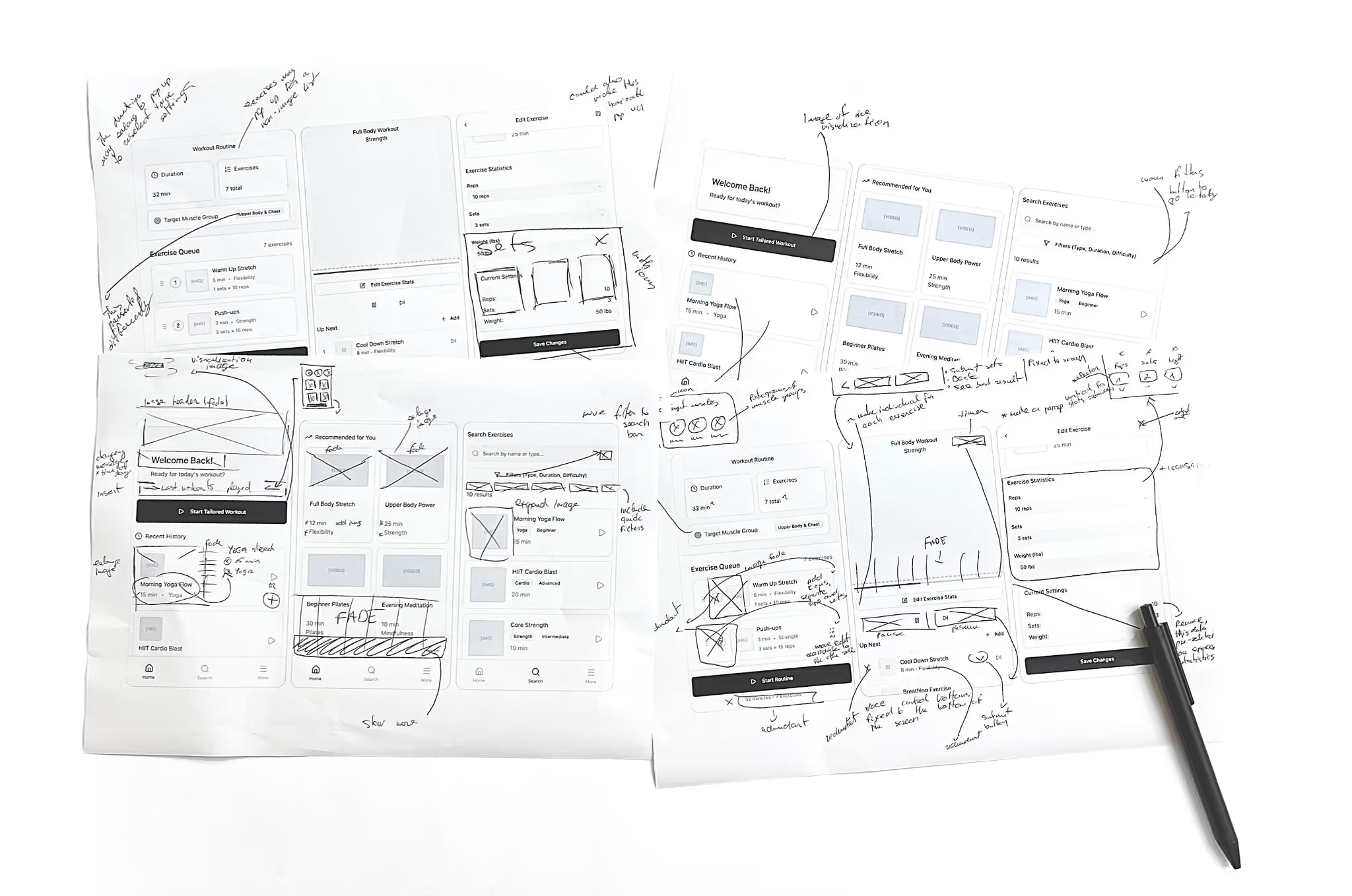
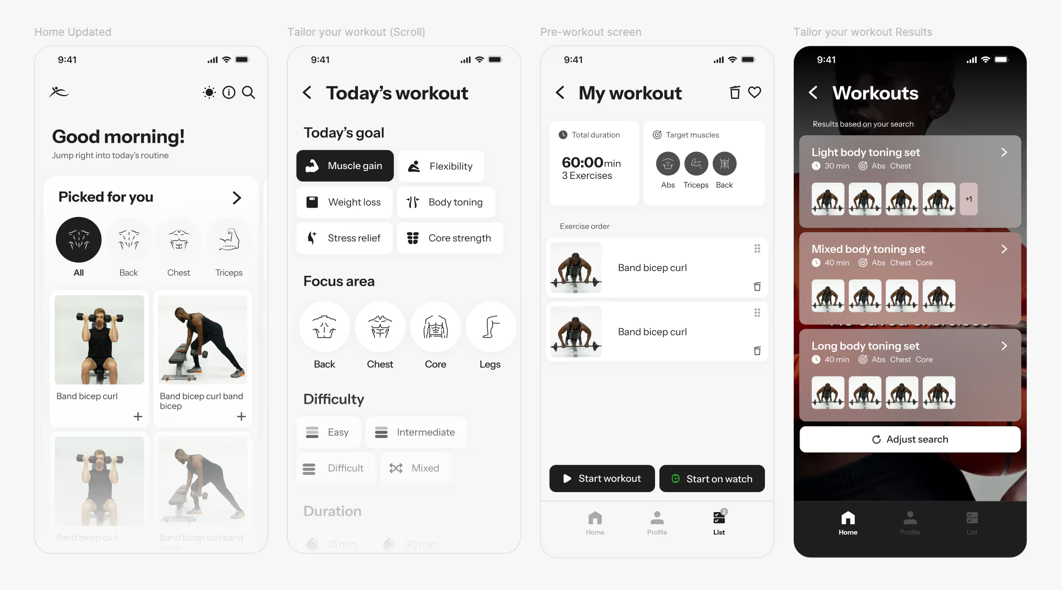
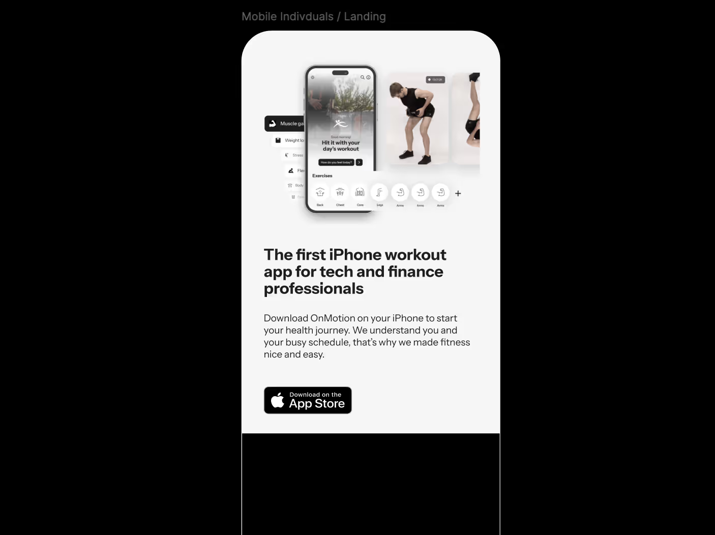
Going into the project, I was aware of the saturated market when it comes to applications and websites for fitness and exercising. Thanks to our small team, together we were able to conduct some tests into the products of our competitors. We analyzed several popular applications that are most similar to ours. We looked at celebrity-backed tools and already well-established applications from Apple & Fitbit. This was an early point of reflection on what our competitors are doing well, their USPs, and the pain points users of these applications are facing that we could solve through our product. For this, things like app store reviews came in handy. Amongst different design and efficiency problems, we learned about the lack of speedy exercise discovery, which turned fitness novices away from using fitness applications. I saw this as the largest gap in the market and an opportunity for us to step in and help users build fitness routines faster, this way drawing more people to our application.

always brainstorming

One of the main challenges throughout the design process for OnMotion was tying in new functions into an application that required simplicity. I was working on this everywhere, sketching  down as soon as an idea would strike. While working on other aspects of the app, I was brainstorming and strategizing the user experience of the home page. It is always important for me as a designer to deliver an application that is free from unnecessary clicks and one that allows for quick, self-explanatory navigation. In the end, we designed two different versions of the main page, where the second one was built based on the data returned after testing the initial iteration.

experience mapping

Based on the team and functional requirements, together with ideas from brainstorming and soft testing, I started putting together a user map. This was necessary when developing our prototype and helped inform the team of the different process stages when developing the applications alongside me. While developing all prototype models, maps are helpful to not miss out on the development of multiple functionalities and allow for development to happen alongside the different processes. For me, maps become incredibly helpful when connecting functions to pages and understanding how the app flows to develop a cohesive experience.

challenges solved by iterating

Doing this process digitally, using collaborative tools, created the space to take feedback and quickly iterate new ideas. In this step, AI tools made this process even faster. One of the largest challenges was developing the play screen — when the exercise program is running. Delivering easy navigation that allows input results, like sets and reps, required learning about users engaged in an exercise routine, who will be using the application during strenuous, speedy, and physically challenging states. This was only possible through lots of iterations.

ideas driven by low-fi testing

Working with a low-fidelity model was helpful because it allowed easy testing. For this, I printed our prototype true to size and together, with help from other designers and prospective users, noted changes and edits that needed to be made. A dual-tone print out was not overwhelmed by effects and visuals, therefore allowing me to focus on user experience and navigation when testing. The goal of this stage was to better understand the way different iterations influence user decision making and overall satisfaction. This was an opportunity for me to begin testing buttons and visual placements to understand exactly how users begin to interpret pages. Furthermore, it was a fundamental step to investigate whether specific functions are useful prior to time-consuming development.

branding

Working with the team, we set up a branding guide. This incorporated advice from the marketing team and aligned with the wider business goals. This meant designing a simple, minimalist, and monochromatic interface that allows users to focus on the video content. This was one way we could visually stand out by ignoring the typical colorful and gamified designs. This took various iterations and has influenced every decision going forward, not only inside the app, but also by inspiring the marketing direction and other visual communications. To ensure that our system functions well, I tested and prototyped light and dark modes for each page.

desingning the ui

The overall design had several iterations over time. Just as in earlier stages, the homepage had a few different designs applied to it. Our focus was iterating until the homepage could offer useful functionality that is visually appealing and easy to navigate.

challenging onboarding

One of our other challenges was tackling the onboarding process. The application has a few functions which, if engaged with initially, will need to be set-up and may dismay users from sticking with the registration process. To combat this, I focused on making our onboarding process clear, getting rid of all unnecessary information, and indicating the number of remaining steps left to reduce the drop-out rate. We have also included an option to skip pages and to test the app as a non-registered user, this way, once again, reducing the likelihood of users dropping out of the process.

testing ui constantly

As with earlier phases, I leveraged personal connections to gather further testing data. I conducted tests with friends and family members to gain a better understanding of their perspective on the fitness app's user interface. Key findings from this small-group testing included positive feedback on the application's styling. Users found the application to be smooth, aesthetic, and intuitive. The onboarding process also received a good reception, indicating that the core UI system required minimal modifications. A significant focus during this stage was also ensuring the application's functionality was consistent across various devices, which heavily informed the design process.

developing website

When the application went into further development stages, I began working on the website experience for OnMotion. This was more connected to marketing and visual development than my regular focus on user experience. However, it was an opportunity for me to work on a wider design task from the perspective of a UX/UI designer. This process was very similar to typical development, going through stages of ideation and testing. Having the UI language defined already meant that the process could move faster. The big challenge, as is usual in web design, was designing for a responsive screen size. This took some testing on different devices to truly ensure nothing was out of place or that the effects were working smoothly.

designing effects

I ensure that the websites and apps I build not only offer a good and clean interface for functionality but also a sleek look with modern effects and interactions. Building for users with specific phone model requirements was reassuring, as we knew what effect on our website would be handled easily and which designs I had to simplify for faster loading. The challenging part is building a responsive website that can resize smoothly. However, working on CSS and JS can be a logically challenging but also an interesting and playful experience, which is what I enjoy the most when building websites.

prototyping in figma

To build the website, I started by analyzing the target audience even further and developing the informational architecture according to our goal — visitors seeing the benefit in using this application, leading them to download it. The first prototypes were done in Figma to better understand the flow of the website and discuss changes and improvements needed together with the team. I then continued developing the website online and visuals inside Photoshop. We also developed another page for trainers, introducing fitness professionals to our application and the ways they can earn money by developing programs for OnMotion.

social media visuals

When developing the website, the founders were seeking to also invite new people into the creative process. We had a few paid visual and marketing design pitches. However, we ultimately decided that these did not fully fulfill our design requirements, which is why I stayed on the project for longer, also working on the development of marketing visuals and wider campaigns. This meant I found myself working in Photoshop to deliver visuals not only for the website but also reworking them for social media, App Store, and print material, while assisting the team with other visual tasks like icon creation and all smaller web and in-app illustrations.

launching grid

While social media like Instagram later would have a larger purpose for continuous marketing, for example, short-form content, we wanted to start by explaining what the application can do for the users. In a sense, this had the same purpose as our website but was a different channel to look for more potential clients. This also meant I was reusing visuals developed for the website by altering the information and resizing the images. While this was in itself an easy process, we created many iterations and reordered our image sequences several times to ensure our message was delivered in the most targeted and powerful way.

onmotion

OnMotion delivered an ambitious application for beginner gym-goers with the goal to bring more people to exercise in a way that is efficient and confidence-boosting. Through delivery of efficient, tailored search tools, we cut down the time users spend searching for appropriate exercises by around 70%. I helped launch several marketing campaigns in collaboration with other brands. In 2025, the application was sold to an investor for further development.