


About
OnMotion is an NYC-based fitness app designed for efficiency. It offers tailored workout recommendations and multi-layered search functionality, addressing the common problem of fitness apps being time-consuming to customize or requiring prior knowledge in fitness. OnMotion provides a faster way to find customized workout routines based on personal goals compared to other applications.

Figma

Photoshop

Webflow
My contribution
I joined onMotion during its early beta phase to enhance user experience and refine strategic direction. My focus was on optimizing the complete service experience, understanding user motivations, analyzing competitor strategies, and identifying unique selling propositions.
I designed over 50 interactive prototype screens in Figma for the development team and collaborated closely with developers to guide the backend construction of the application. Additionally, I was responsible for the marketing visuals and creating the fully responsive website using Photoshop and CSS builder.
Existing beta
Upon analyzing previous beta versions, including existing exercise libraries and foundational elements, I identified opportunities to enhance the user experience and align the app's aesthetic with competitor offerings. I also assessed unique selling proposition (USP) opportunities, focusing on refining existing functions and developing new ones to create a distinctive product for marketing and differentiation while also solving problems users face using fitness platforms.
.avif)
.avif)
.avif)
The problem
Upon analyzing previous beta versions, including existing exercise libraries and foundational elements, I identified opportunities to enhance the user experience and align the app's aesthetic with competitor offerings. I also assessed unique selling proposition (USP) opportunities, focusing on refining existing functions and developing new ones to create a distinctive product for marketing and differentiation while also solving problems users face using fitness platforms.

Ideas
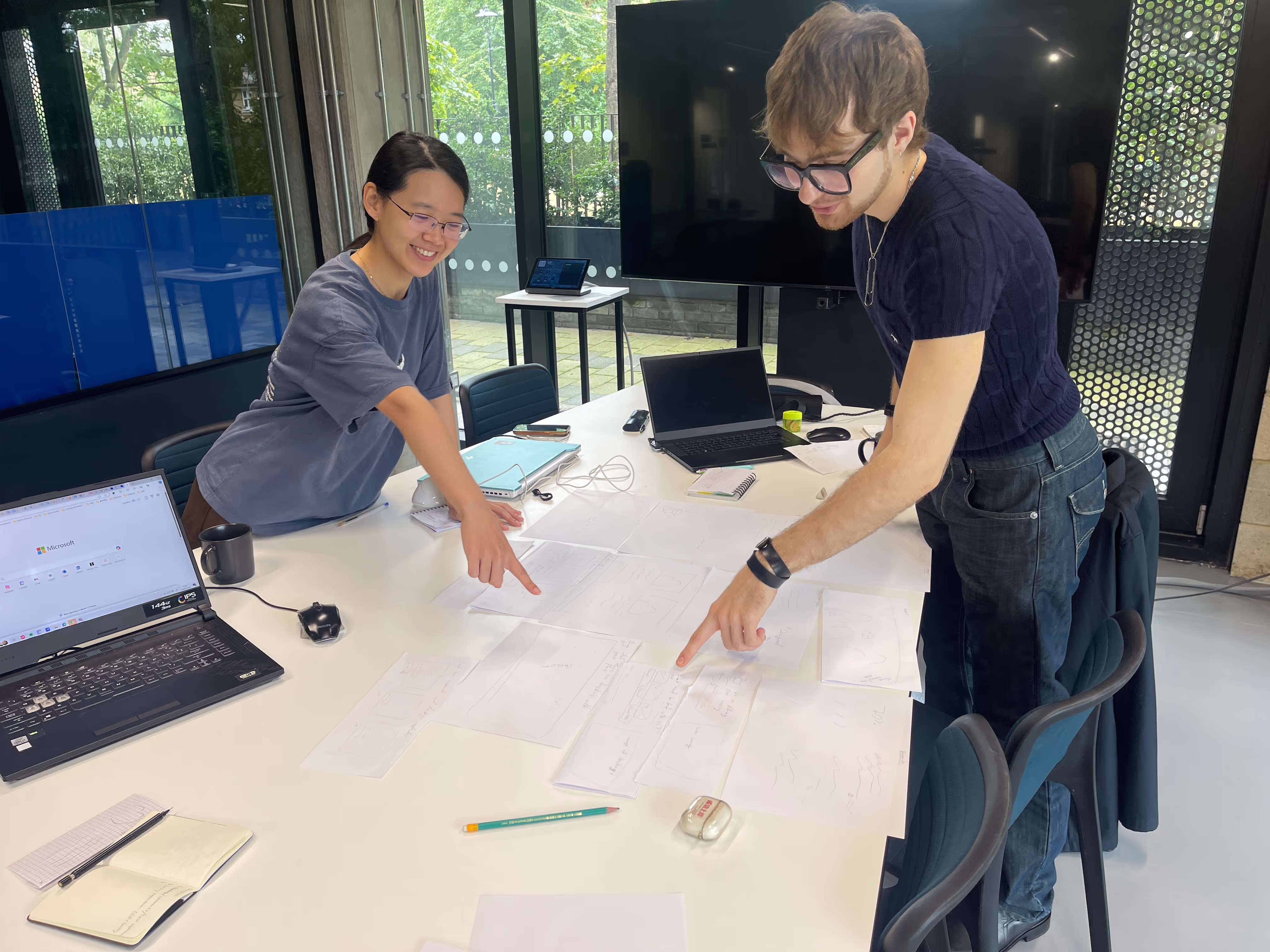
To brainstorm solutions, we held meetings and utilized a shared Miro board with the marketing and development teams. I worked on finding solutions through conversations with users and floated those ideas by people we’ve spoken to before. During these sessions, we collected and organized information by function for later evaluation. This was a free exercise, welcoming all ideas. We developed several conceptual maps using tools such as Six Thinking Hats and the Futures Workshop. Additionally, we used AI to generate a comparative version based on internet data.
Competition
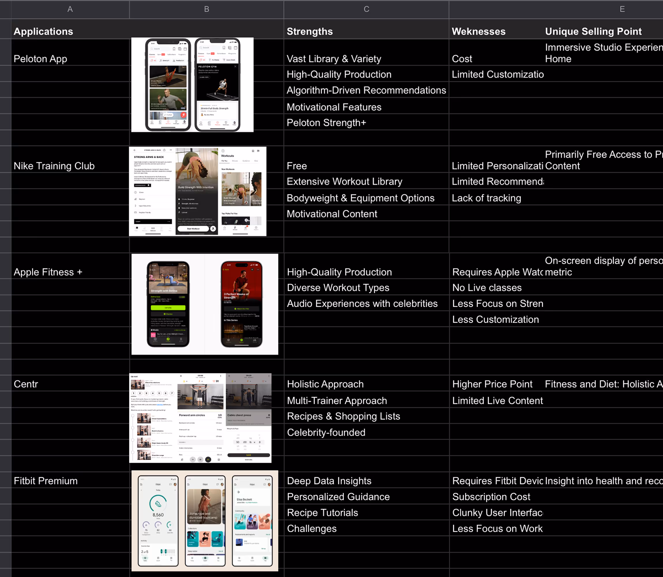
I analyzed existing solutions to understand their strengths, weaknesses, and USPs. This helped identify potential pitfalls, opportunities for new features, and allowed for strategic comparison with our current standing. I evaluated user-requested features and assessed funding models and user sentiment to gain a holistic view of the competitive landscape, enabling us to enhance our service and user experience.
Functions
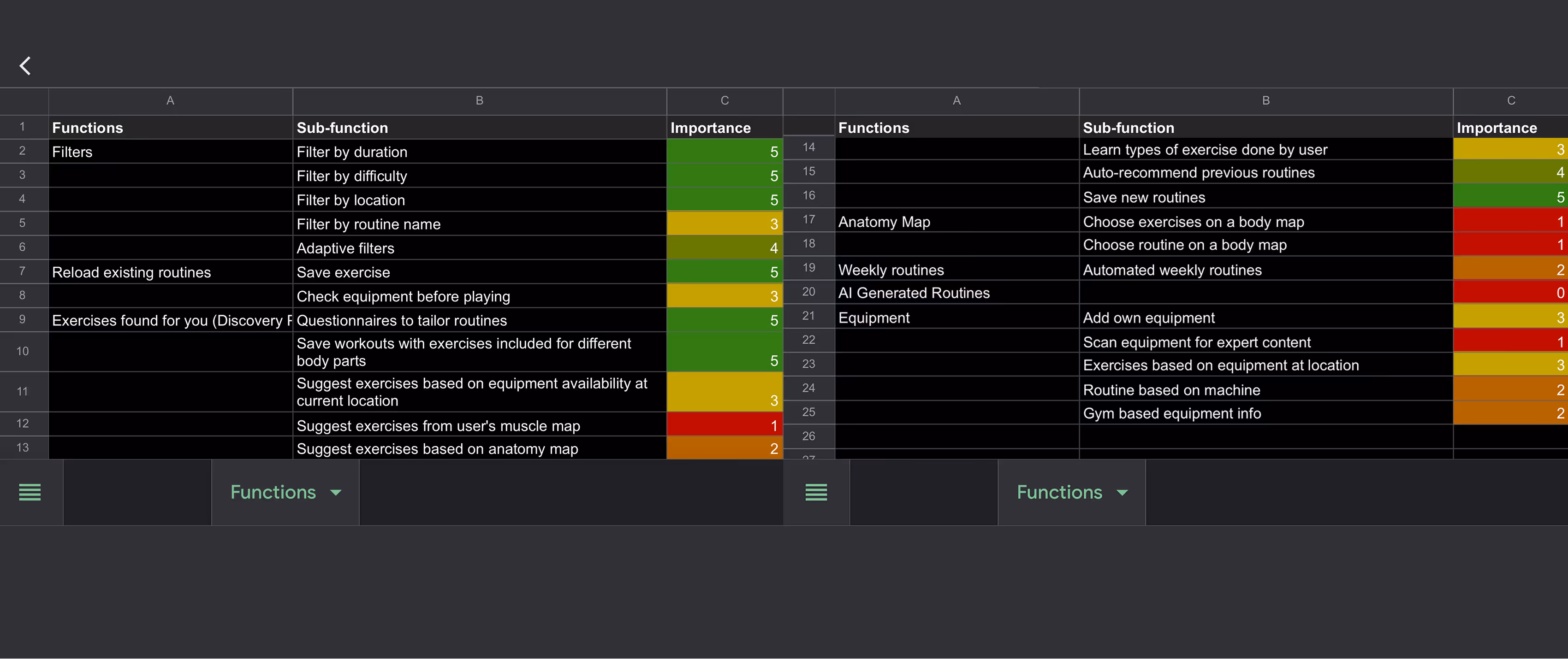
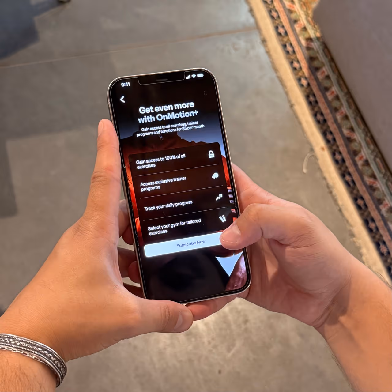
During the application development phase, we prioritized functions based on a comprehensive evaluation. I compiled a list of all application ideas and assessed them from the perspectives of users, competitors, and developers. These ideas were then rated, with the highest-rated items being selected for initial development. This approach allows ample time for testing and revisions that we could push to beta testing on beta users’ devices, while also preventing the application from becoming overcrowded.

%20Rewards.avif)
UX Mapped
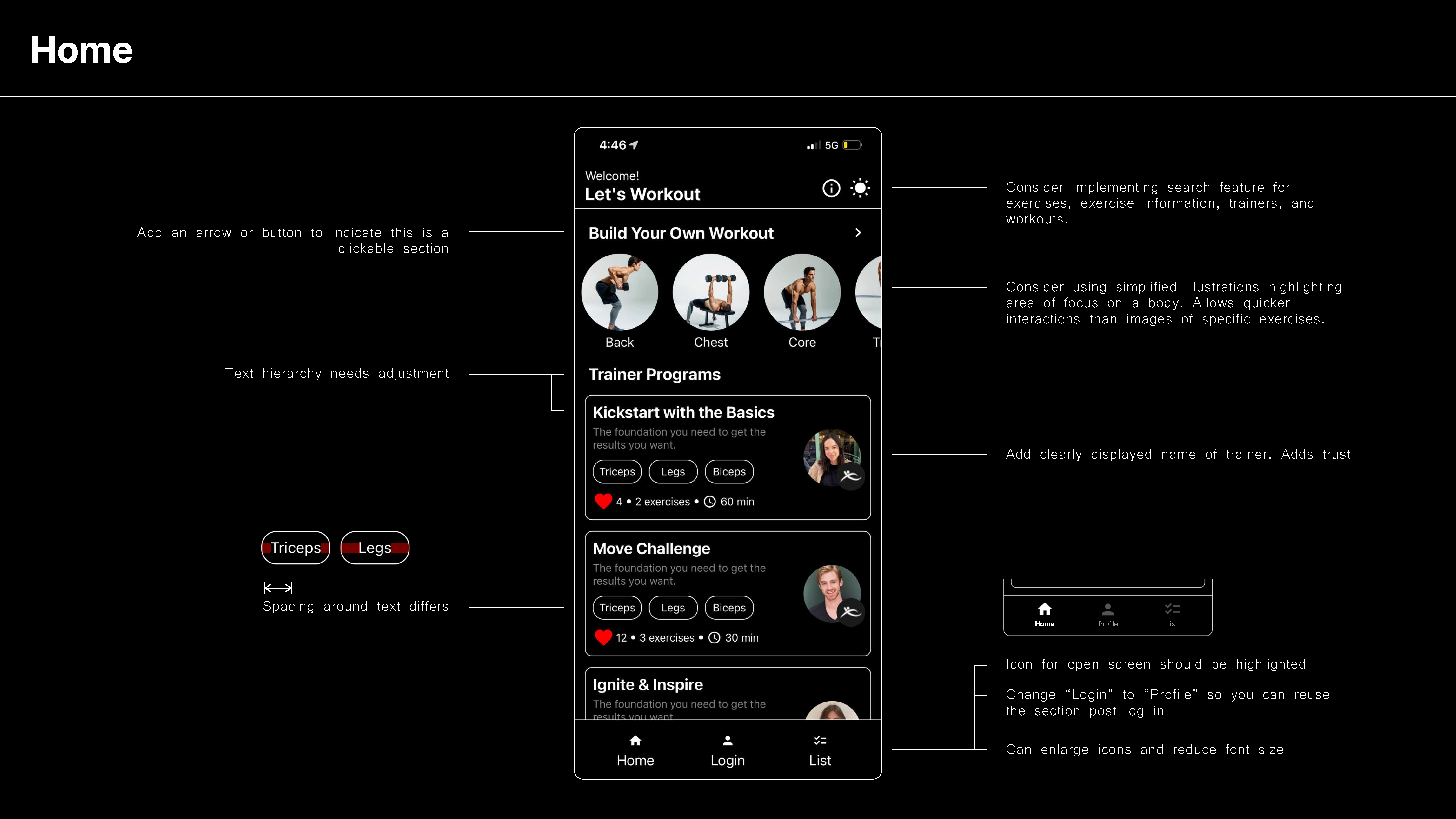
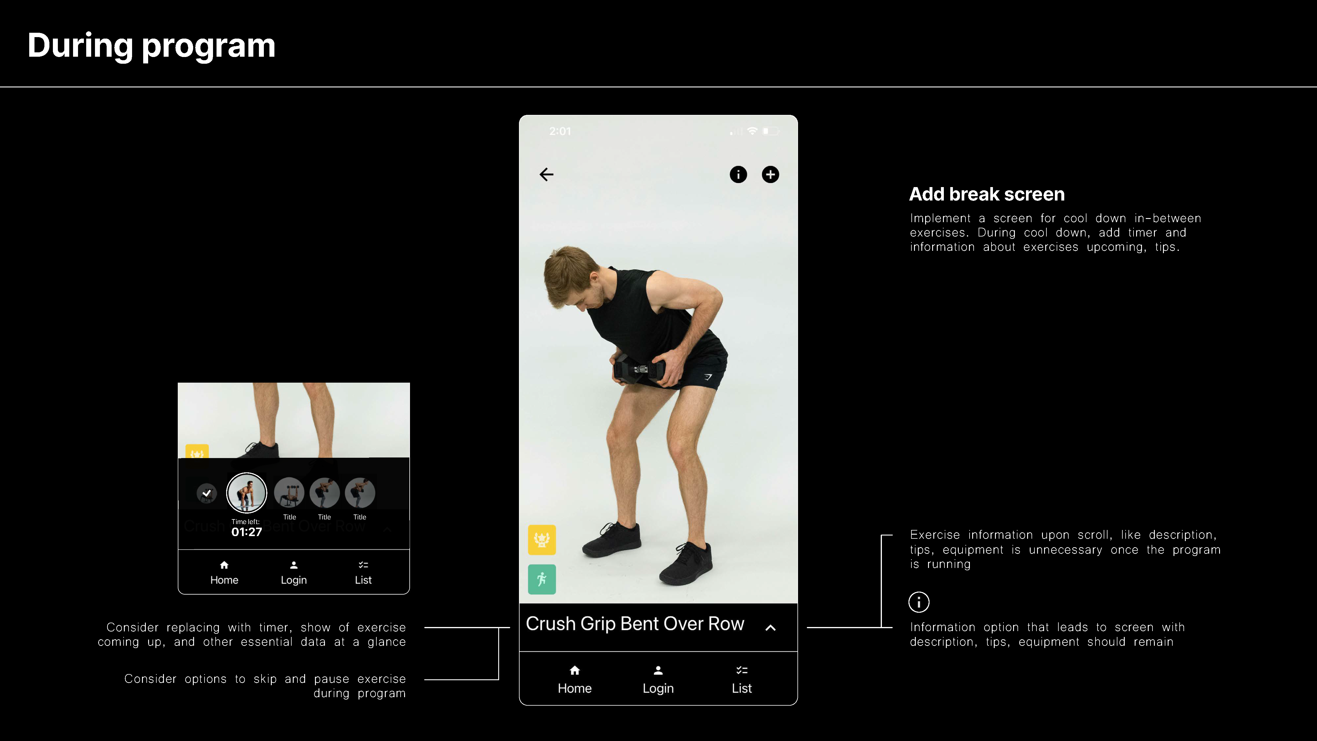
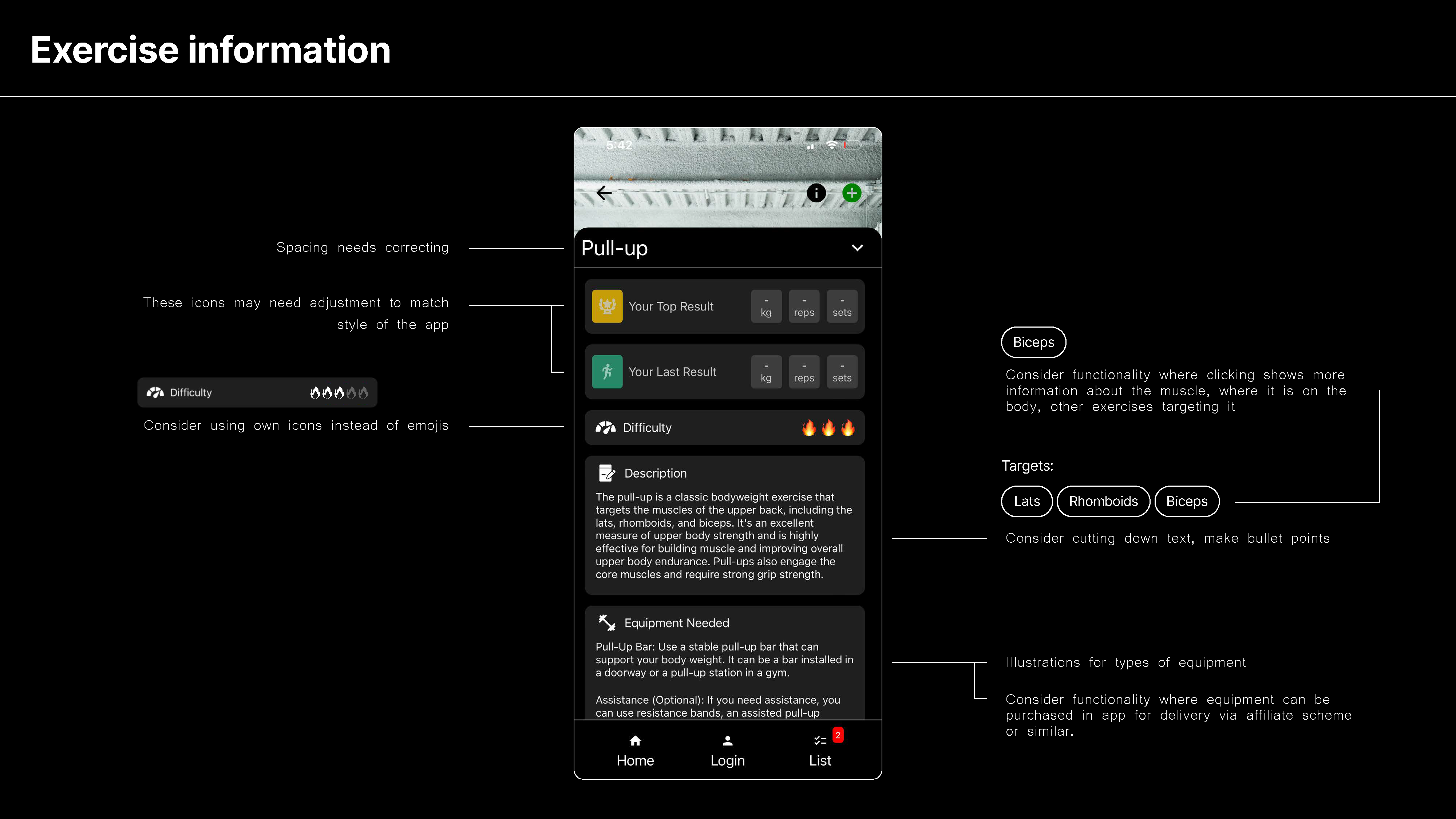
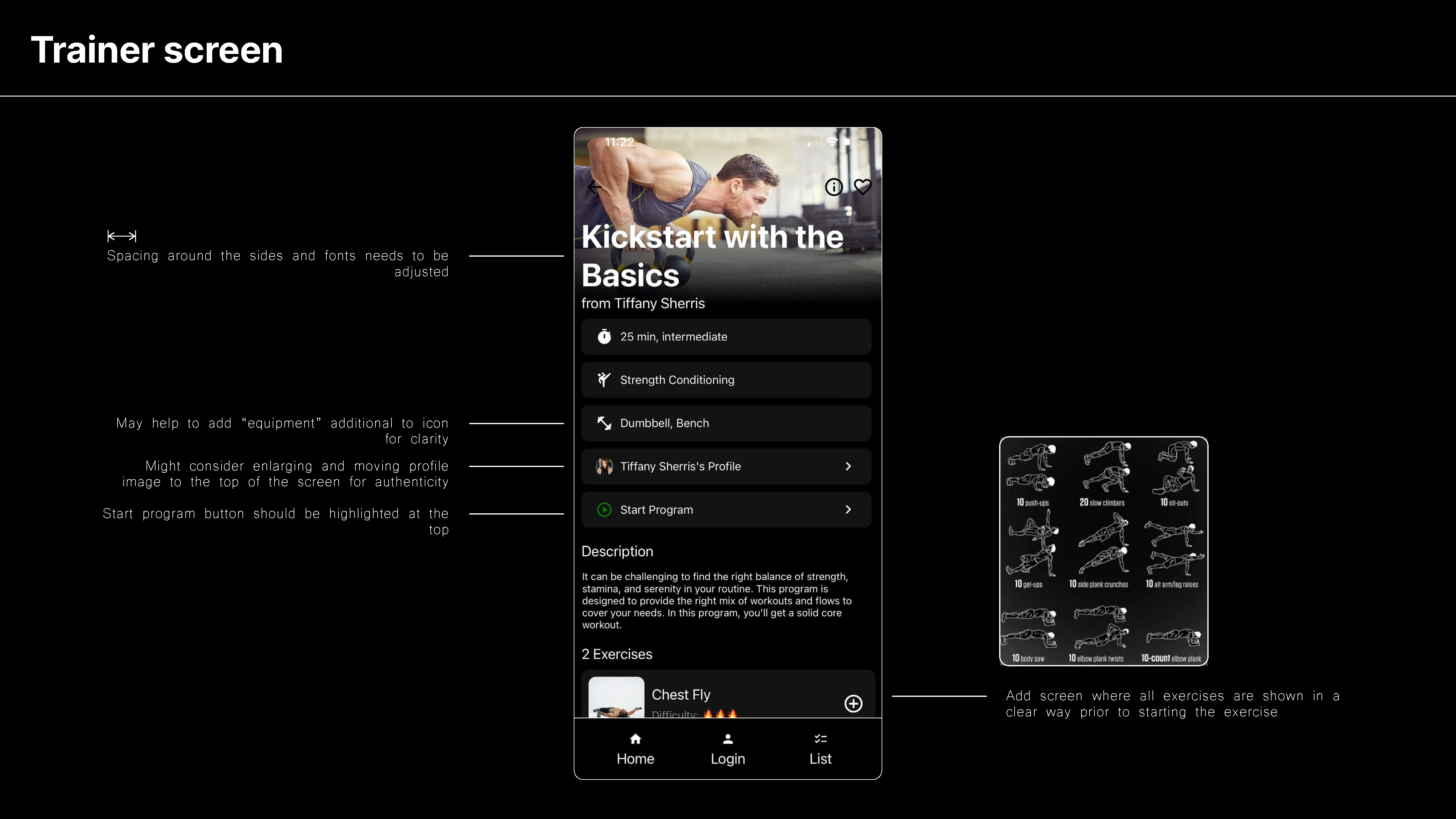
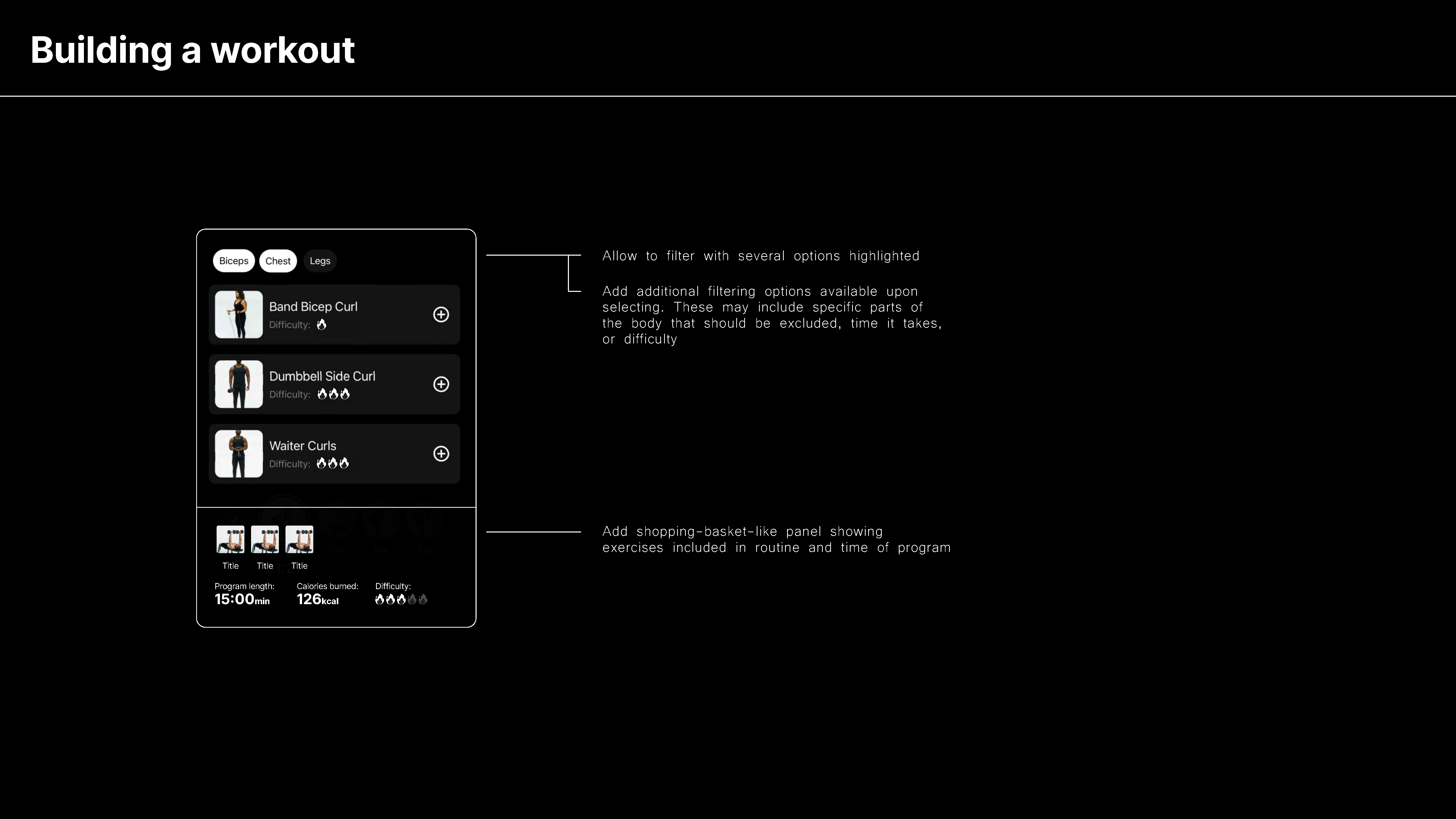
I developed a user experience map for early testing of all new prioritized functions to ensure the inclusion of necessary features. I also improved existing pages from previous beta versions. I refined the app's navigation to streamline the user flow, freeing up screen space for metric information and exercise content by relocating secondary controls into modals or removing them. During this process, I identified and resolved inconsistencies, taking backend considerations into account.
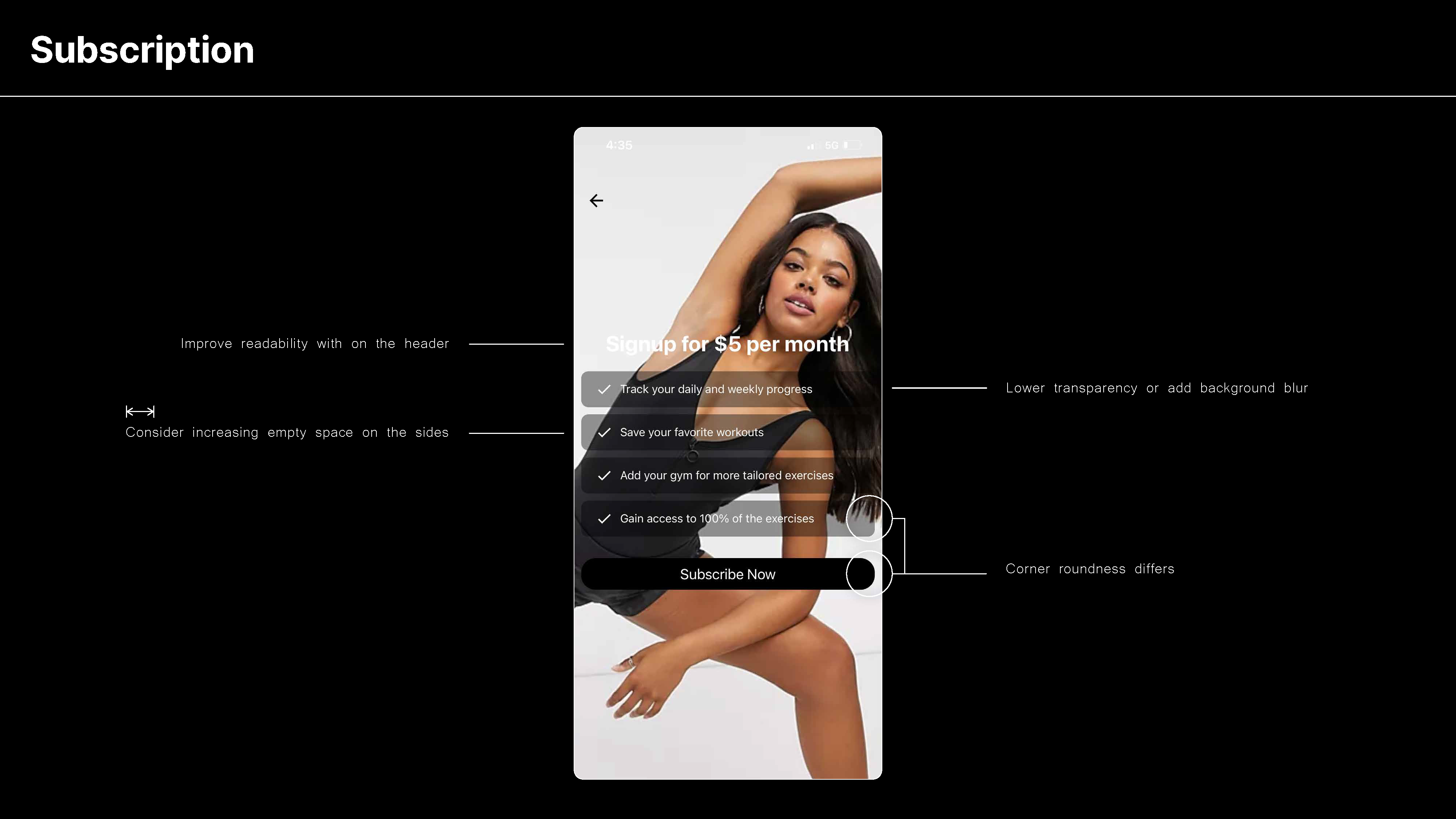
Testing UX
Upon creating the UX map, we conducted extensive internal testing to understand the user flow. I also performed a number of tests focusing on UX principles to optimize speed and ease of navigation, especially considering the active engagement required during workouts. This involved testing for control placement and screen space utilization. We then iterated on the design based on feedback from external reviewers before moving on to the next development phase.
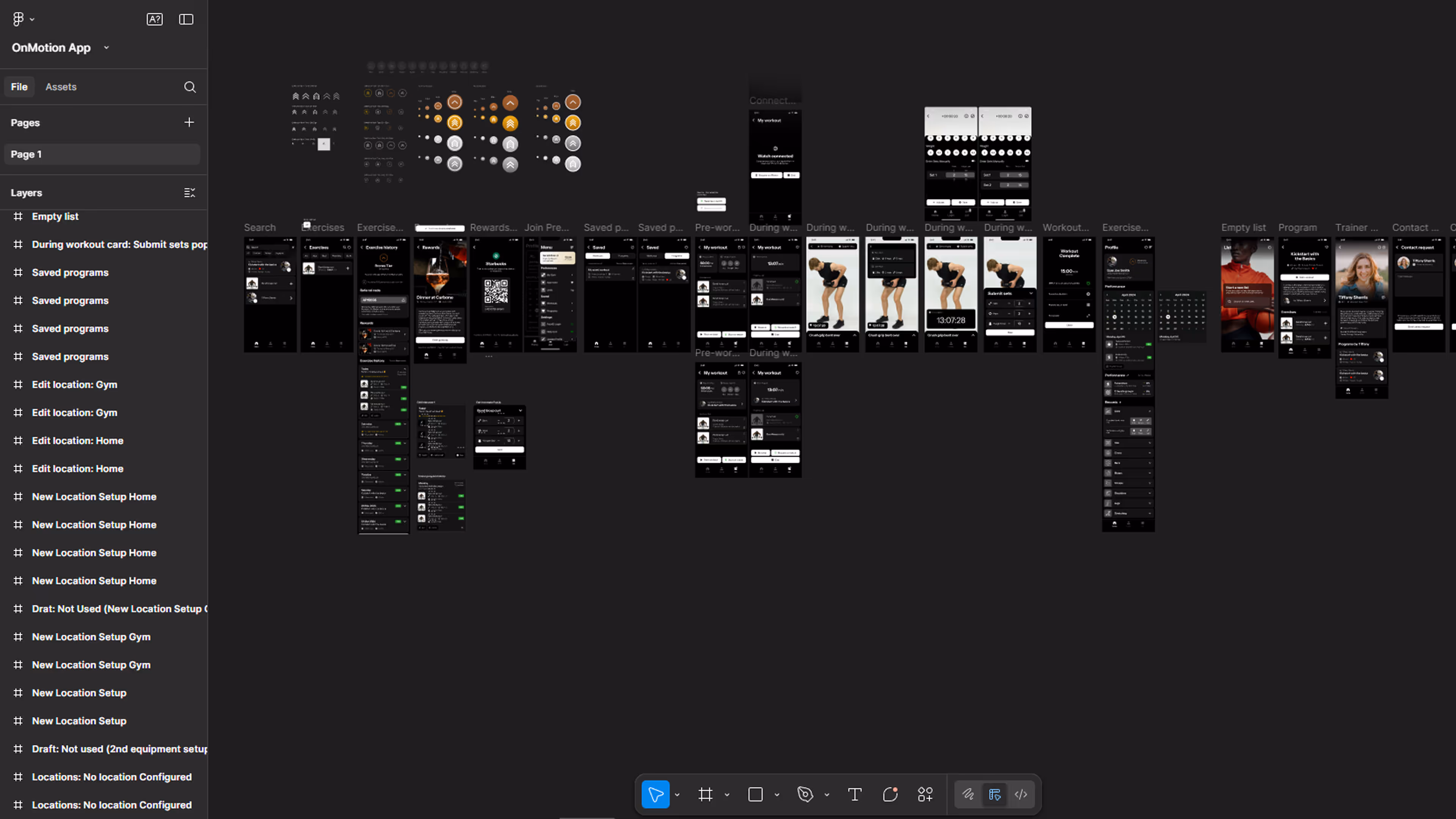

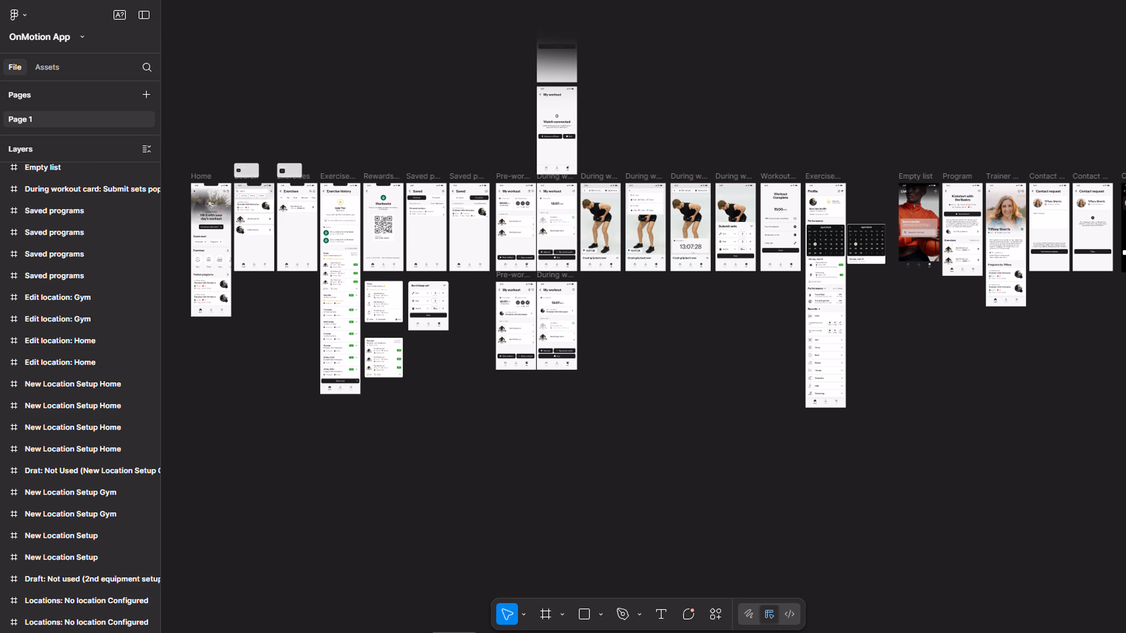
UI Map
Using the final UX map, I translated the results into over 50 screens (light and dark mode) within Figma. Through consultations and iterative testing with potential users, we continuously refined our design choices, allowing us to make constant improvements and identify where the user interface could be improved. I also redesigned our icons (Illustrator) and delivered additional visuals (Photoshop). This process also led to the complete refresh and cleanup of our design system.
Testing UI
Similar to previous steps, we conducted several UI tests to assess user perception of our visual style. My primary focus was on ensuring a simple and clear user experience, implementing only essential elements, and utilizing graphics to guide users. Through small-scale tests, we gathered feedback on various pages and designs, ultimately deciding on a straightforward color scheme and visual compositions that align with our brand image.
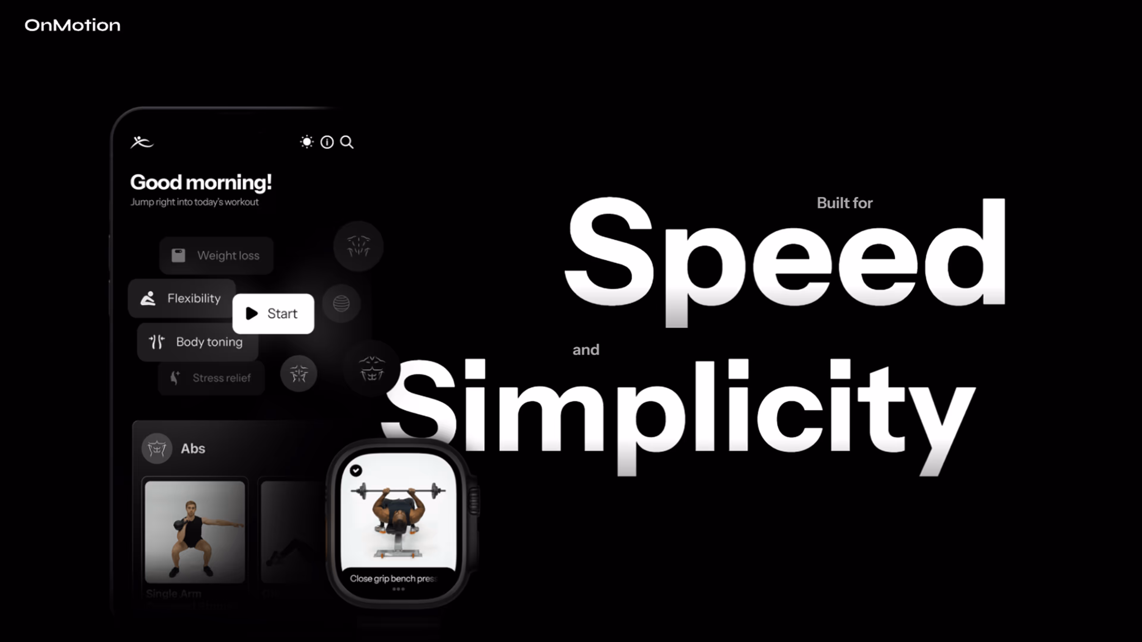
%20Designed%20for%20Speed%20and%20Simplicity.avif)
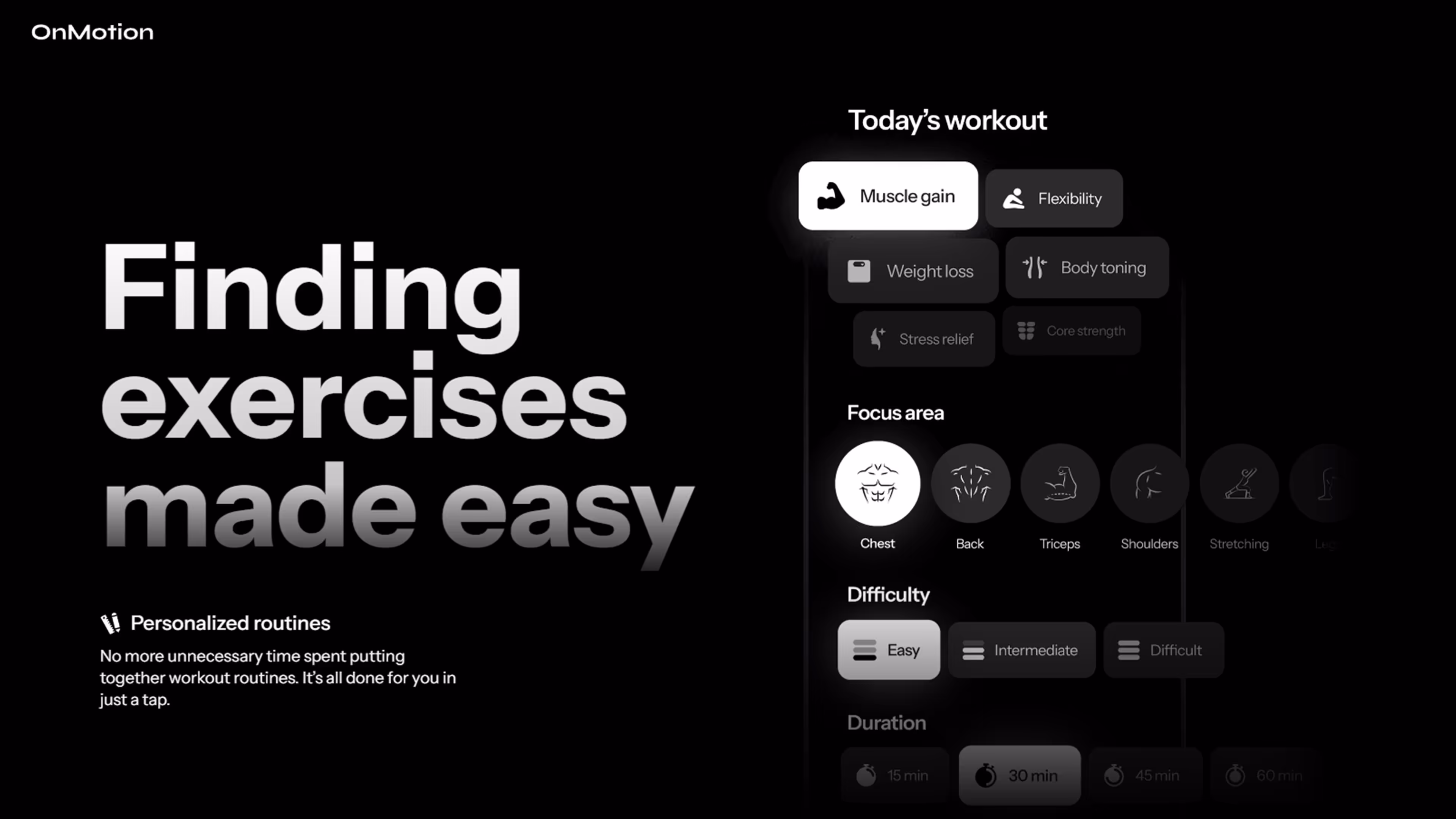
%20Finding%20Exercises%20Should%20Not%20Be%20an%20Exercise.avif)
%20Fitness%20the%20way%20you%20like%20it.avif)
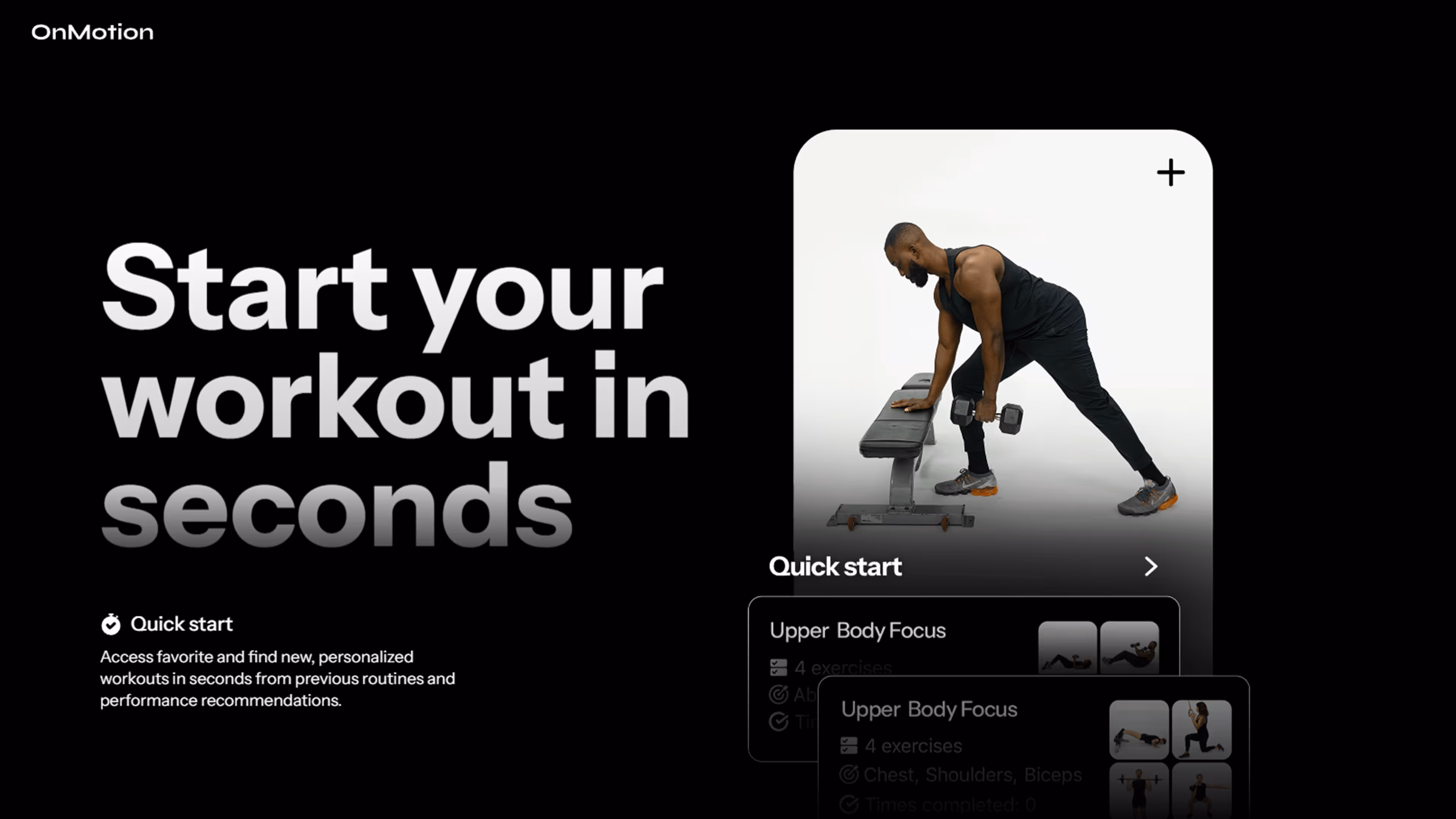
%20Every%20Workout%20Saved%20for%20Easy%20Access.avif)
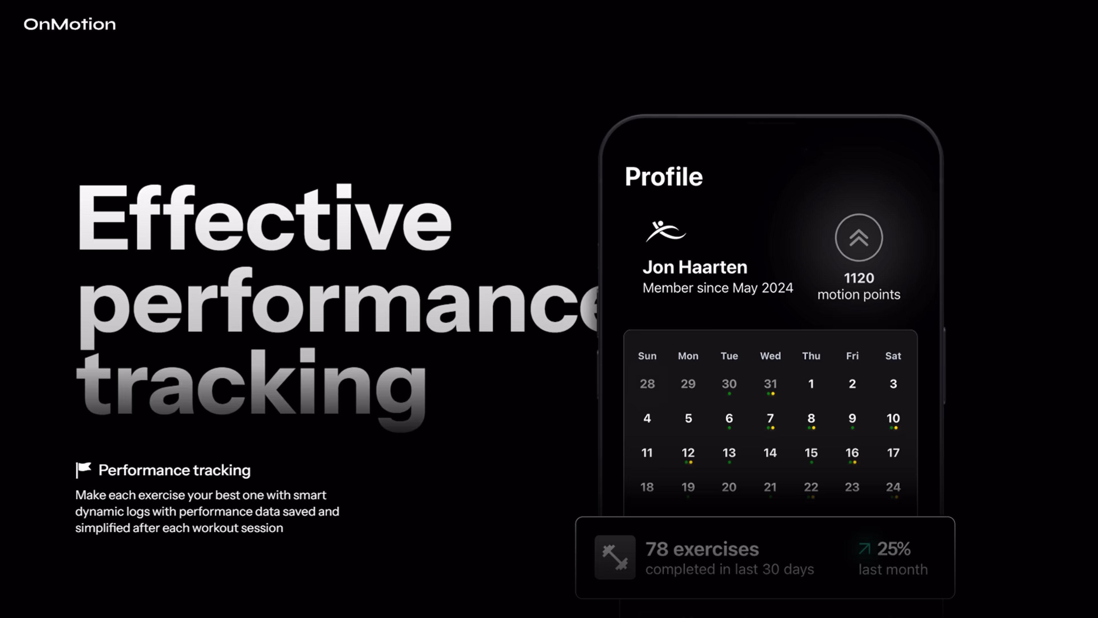
%20A%20Powerful%20Database%20of%20Exercises%20Fit%20for%20You.avif)
%20Giveaway.avif)
Marketing
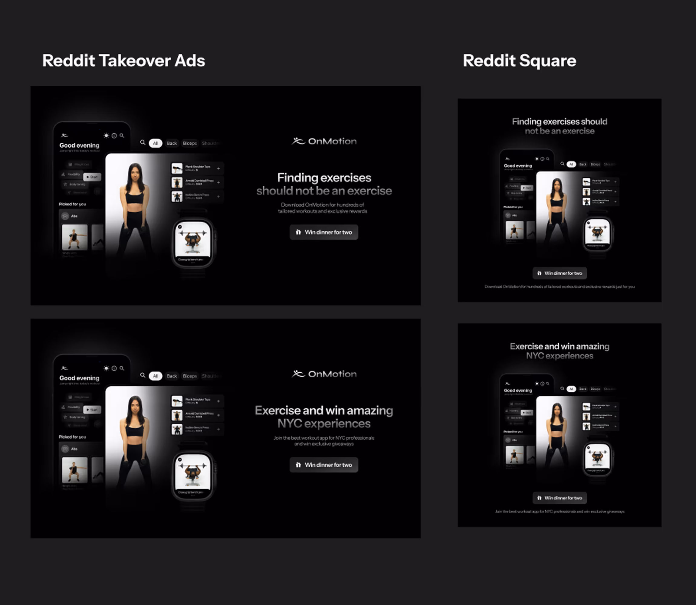
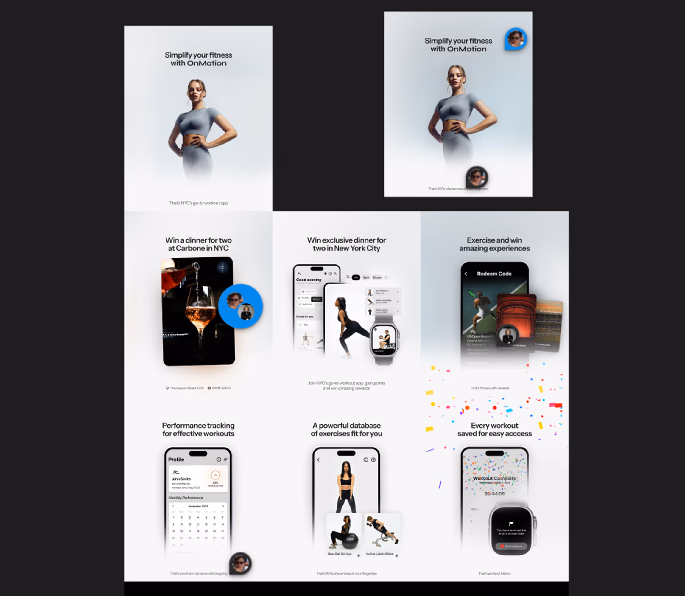
Our marketing team translated our strategic user-centric approach into a clear marketing plan. Based on this, I created visual designs using Adobe, including a social media grid that effectively communicated our message. I also designed App Store visuals, highlighting the app's unique selling proposition. We developed and tested visuals for Reddit and LinkedIn, as well as Instagram ads. I monitored ad performance and implemented a loyalty system to boost user engagement and acquisition.

Adverts
I developed visual assets and collaborated with a marketing strategist to create our advertising plan. I produced various versions of advertisements for platforms such as LinkedIn, Google Ads, and Reddit. Subsequently, we monitored their performance in conjunction with an on-site giveaway. I also created visuals for our App Store media and OnMotion's social media grid using Adobe Photoshop.
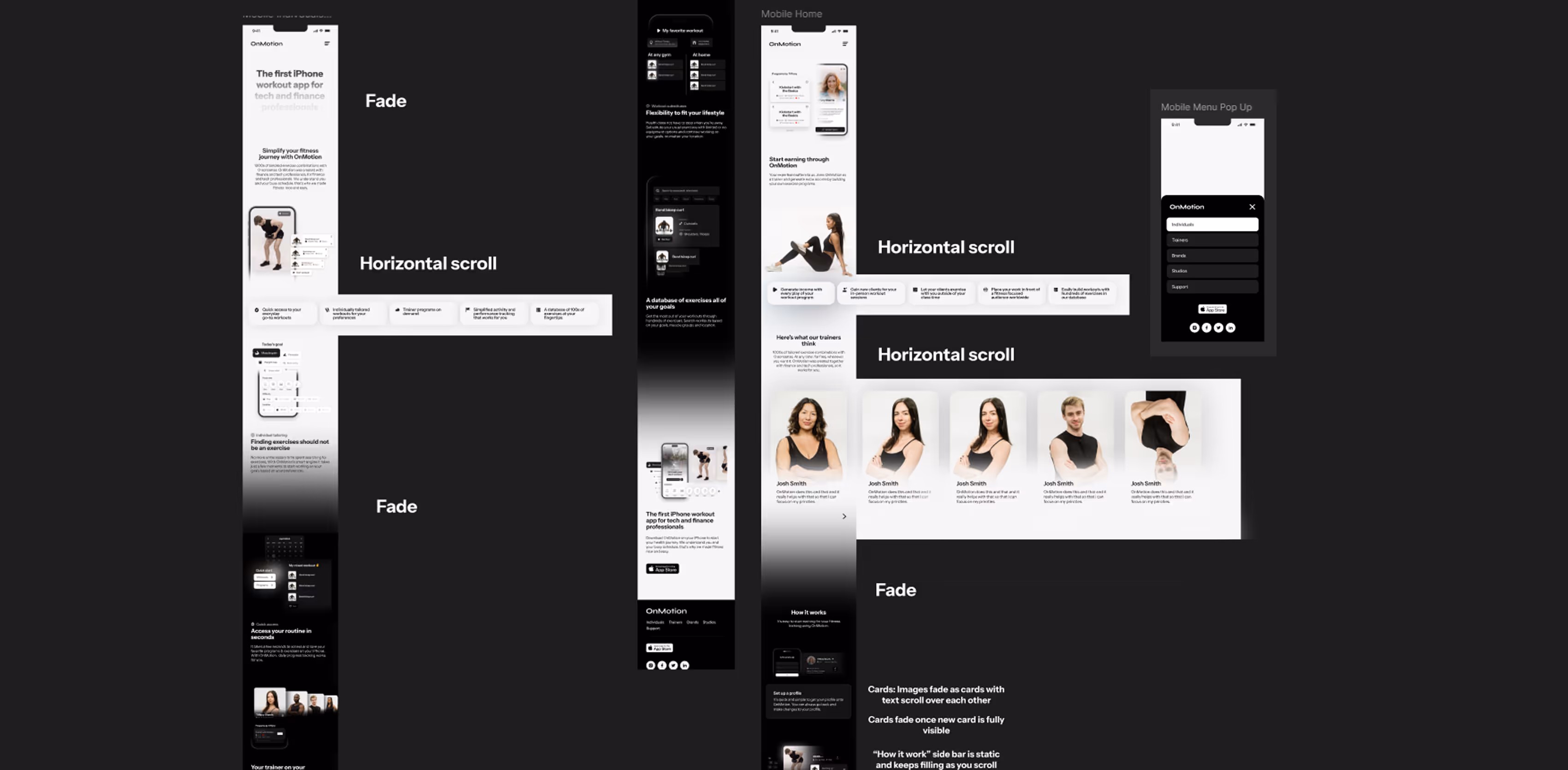
Website
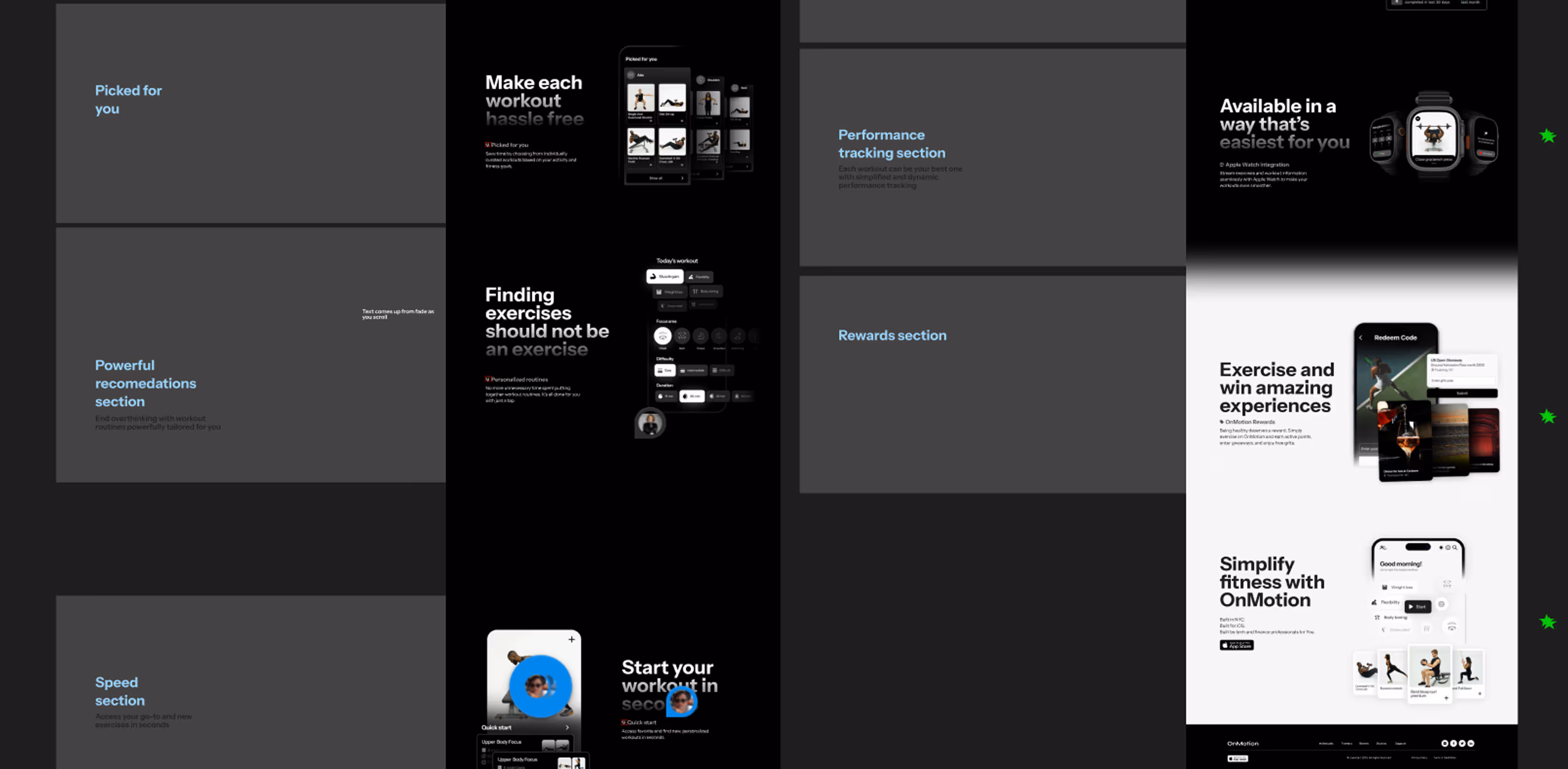
I led the development of the company website, applying insights from my strategic work and competitor analysis to create a responsive site that effectively communicated our application's functionality with style. I utilized new and existing visuals (Photoshop) to build the website (Webflow) with engaging scroll interactions. I also ensured the site was optimized for various screen sizes and both mobile and desktop experiences remain stylish and informative. Alongside this, I also worked on a trainer’s website platform that is yet to be released.
Results
OnMotion is now available on the App Store for download, allowing for expansion of our tester base. Collaborating with the development team, I contributed to the successful release of the application within a year, achieving our goal of creating a tool to reduce time spent searching for exercises. I established the new design and style guidelines, resulting in a cohesive final digital product.
In 2025, the OnMotion project was sold to a new team for continued development.